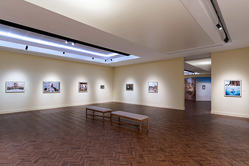
Javett In Bloom: Exploring Exhibition Colours at Javett-UP
News from Javett-UP
06 November 2026
Every spring, Pretoria comes alive with the purple blossoms of Jacaranda trees, transforming its streets and reaffirming its identity as the Jacaranda City, home to Javett-UP. But what happens when colour moves beyond the landscape and finds its way onto exhibition walls?
In 2024, purple took centre stage in our then exhibition We’The Purple, demonstrating how a single colour can hold multiple meanings, from its associations with Pretoria and the international women’s movement, to its significance in the history of the Purple Rain Riot in Cape Town.
At Javett-UP, colour is more than a visual experience. Across exhibitions, it can evoke emotions, carry histories and offer new ways of seeing and understanding the world around us.
This spring, we invite you to look again at the colours that shape galleries of our latest exhibitions and discover some of the stories, ideas and curatorial choices behind them.
1. We Didn’t Choose to Be Born Here | Colour: Kiwi Yellow
The choice of Kiwi Yellow draws inspiration from Botswana’s landscape, where exhibiting artist Thero Makepe originates, particularly its dry terrain, as well as the colours traditionally used on homes in the country. The distinctive shade creates a visual connection between the exhibition’s identity and its geographical context, grounding the exhibition in a particular sense of place.
2. Orchard of the Imagination: Selections from The Brenthurst Collection of Southern African Art | Colours: Pink and blue
The pink and blue palette draws inspiration from the colours found within The Brenthurst Collection, particularly the beaded works. The shades reference the pink and blue beads used in the fertility figurines and dolls, creating a visual connection between the exhibition’s design and the collection itself. Through this relationship, the exhibition’s colour palette extends beyond the gallery walls, reflecting the materials, details and visual qualities of the objects on display.
3. String Theory | Colour: Twilight Zone — deep purple-blue
The deep purple-blue shade, Twilight Zone, evokes the vastness of the cosmos and the mysteries of the unknown being explored by exhibiting artist Kamil Hassim. Its atmospheric quality recalls the depths of space, inviting associations with distant worlds, celestial phenomena and the questions that lie beyond our immediate understanding.The colour reinforces the exhibition’s conceptual engagement with the cosmos, creating a visual environment that encourages visitors to contemplate the relationship between the familiar and the unknown.
4. Passage—a Song | Colours: Frost Grey and Glistering Sea
Grey is the predominant colour in the exhibition, reflecting photographer Abrie Fourie’s established approach to colour and exhibition design. Its restrained presence creates a visual framework through which visitors encounter the photographs.
The introduction of Glistering Sea, a shade of blue, adds another dimension to the exhibition’s visual identity. Although the blue was not necessarily selected to communicate a specific concept, it may evoke associations with the sky and the natural world, offering a subtle point of connection within the gallery space.
Visit Javett-UP this Spring to discover more stories, meanings and perspectives these colours hold. You might be surprised by what a closer look reveals. The Art Centre is open Tuesday- Saturday (and Last Sunday of the month) from 10:00 to 16:00. Book a visit on Webtickets. Walkins are also welcomed.
